In 2026, a MedTech startup’s website is more than a marketing tool, it’s a pre-investor diligence signal. It outlines the four essentials of an investor-ready site: mobile-first design, StoryBrand clarity, strategically positioned social proof, and one clear next step, showing how a coherent digital presence builds trust, accelerates funding, and aligns your brand with your raise.
An investor gets your warm intro on a Tuesday afternoon. Before they reply, they do what everyone does. They go to your website.
What they find in the next ninety seconds determines whether they read your deck or archive the email.
This is not a hypothetical. It is the funding reality of 2026, where brand credibility has become a diligence signal. We wrote about this in our earlier piece on the invisible reason MedTech startups stall before they scale. The companies that raise faster are not always the ones with superior clinical data. They are the ones whose entire external presence tells a coherent story before anyone picks up the phone.
Your website is doing that work whether you've designed it to or not. The question is whether it's working for you or against you.
The 2026 Funding Reality: Brand Is Now a Due Diligence Signal
The bar for what investors expect from a pre-Series B MedTech company has moved. A few years ago, a functional website with your device image and a contact form was sufficient. The assumption was that the science would speak for itself in the room.
That assumption no longer holds. Institutional investors and strategic partners are conducting digital diligence before the first meeting. They are assessing whether your external narrative matches the ambition of your raise. They are looking for evidence that you understand your market, your customer, and your positioning well enough to scale.
A website that reads like a regulatory filing does not pass that test. Neither does one that buries the clinical problem you solve under three layers of feature-benefit copy.
Brand is not cosmetic at this stage. It is a signal about the quality of your commercial thinking. And right now, for a significant number of MedTech startups, it is sending the wrong one.
The Investor-Ready Website Checklist
Before your next raise, your website needs to clear four bars. Not aspirational bars. Minimum bars for a company asking sophisticated capital to take it seriously.
1. Mobile-first, without exception.
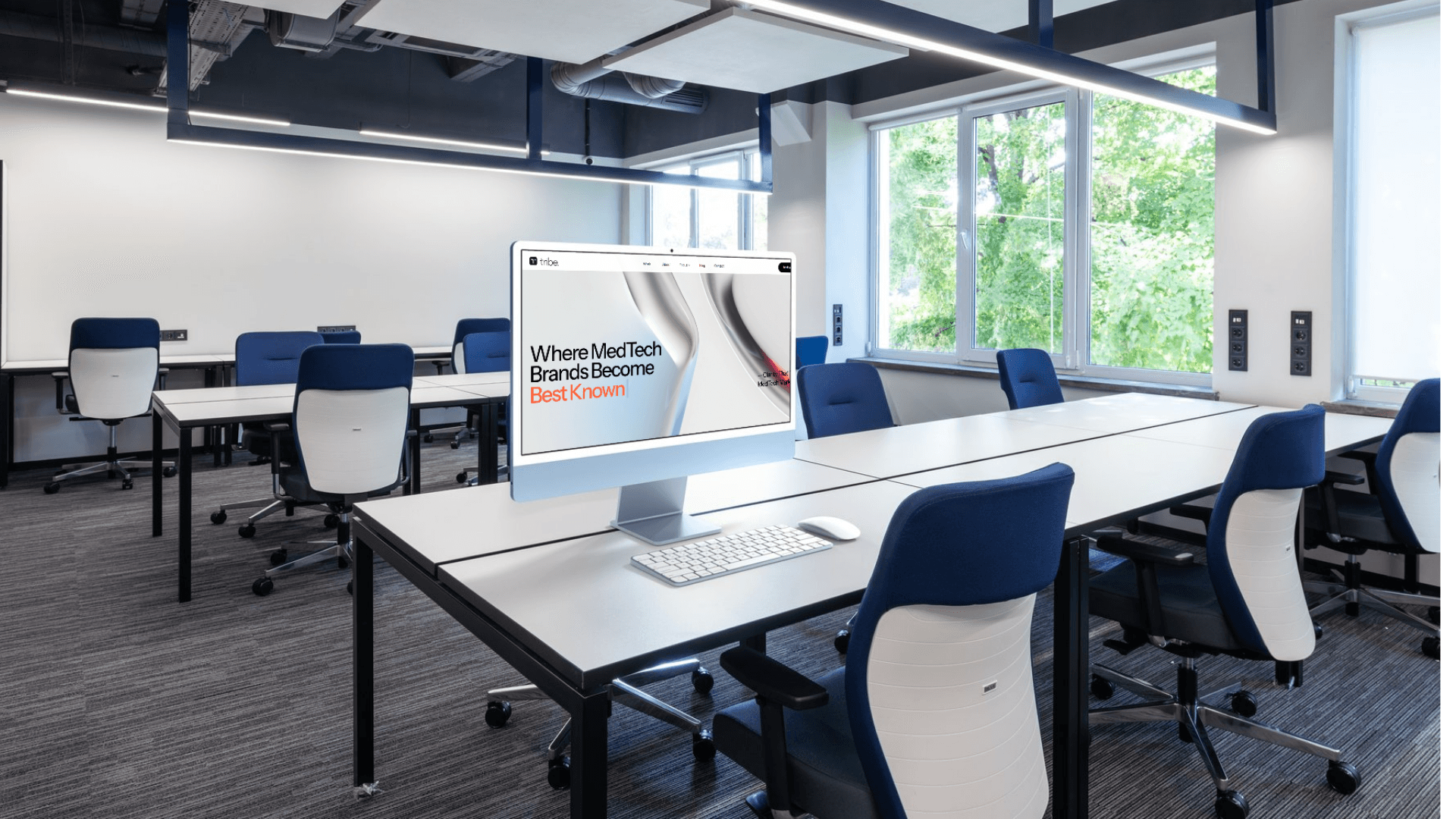
Investors check websites on their phones. Full stop. If your site loads slowly, collapses awkwardly, or buries your key message below the fold on a mobile screen, you have lost them before they read a word. This is a technical requirement, not a design preference. Audit it today from your own phone and fix what you find.
2. StoryBrand clarity from the first sentence.
The StoryBrand framework built by Donald Miller is not marketing theory. It is a diagnostic tool for whether your messaging is working. The core principle is this: your customer is the hero of the story. Your company is the guide. Most MedTech websites do the opposite. They lead with the technology, the founder's credentials, or the device specifications. The clinician or hospital system you are selling to does not see themselves in that story.
The fix is structural. Your homepage headline should name the problem your buyer is living with right now. Your subheadline should articulate what changes when they work with you. Everything else on the page should answer one question: why should I trust that this company can actually deliver that outcome?
Applied to pitch decks, the same principle holds. Investors are not buying a device. They are buying a thesis about a market problem large enough to justify the capital. Lead with the problem. Make the device the proof point.
3. Social proof positioned where it creates conviction.
Testimonials buried in a footer do nothing. Clinical validation data hidden in a PDF download does less. The investors and clinical champions you need to move do not dig for evidence. They respond to evidence placed directly in their path.
If you have a KOL who has used your device and will go on record, that belongs above the fold. If you have a health system pilot in progress, name it. If you have a peer-reviewed publication, lead with what it proved, not just that it exists. The goal is not a credentials wall. It is a confidence builder placed at the exact moment a visitor is deciding whether to keep reading.
4. One clear next step, not five.
The most common website failure we see in early commercial MedTech companies is what happens at the bottom of every page. There are four CTAs competing for attention. Schedule a demo. Download a white paper. Subscribe to a newsletter. Watch a video. Connect with us.
Too many options is functionally the same as no option. For a pre-raise or early commercial company, there should be one primary action you want a visitor to take. Define it. Build the entire page to lead there. Everything else is a distraction.
What Investor-Ready Actually Looks Like
Investor-ready does not mean expensive. It means coherent.
A coherent external presence has a homepage that any intelligent person outside your industry can read in two minutes and understand exactly what you do, who it is for, and why it works. It has a leadership page that shows the depth of domain experience behind the company without reading like a CV. It has a clear articulation of the problem being solved that would resonate with the clinician, the hospital administrator, and the investor simultaneously.
The pitch deck should feel like a continuation of the website, not a departure from it. If the messaging is consistent from the first digital impression through the formal raise narrative, investors experience coherence. Coherence creates confidence. Confidence accelerates decisions.
If your website and your pitch deck are telling two different stories about what your company is, that inconsistency registers. Investors may not name it explicitly. But it surfaces as doubt, and doubt slows capital.
How to Approach This Before Your Next Raise
The mistake most founding teams make is treating the website redesign and the fundraising prep as separate workstreams. One gets handed to a developer. The other gets worked on internally. They finish on different timelines, with different messaging frameworks, built on different assumptions about what the company is trying to communicate.
The companies that show up to a raise with the strongest presence are the ones that treated brand, website, and investor narrative as a single integrated project. The messaging framework that anchors the pitch deck is the same one that drives the homepage. The problem statement that opens the investor conversation is the same one a clinician finds when they Google the company for the first time.
That integration does not happen by accident. It requires someone who understands both the commercial strategy and the communication architecture to hold them together.
If you are twelve to eighteen months from a raise and your website still looks like it was built during your 510(k) sprint, the window to fix this is now. Not two weeks before the roadshow.
If you are preparing for a Series A or B raise and your digital presence is not yet doing the work it needs to do, Tribe's combined Investor Strategy Session and Website Audit is designed for exactly this stage. We look at your brand messaging framework, your site architecture, and your pitch narrative as one integrated system and tell you plainly what is working and what is costing you.
Book a session at tribeconsulting.co.